New York Festivals
NYF Advertising Awards- UI/UX
- Web Design
- Responsive Design
- Site Architecture
- Frontend Dev
- Custom CMS
- Form Design
- Interaction Design
Synopsis
A large project that required a single design to fit six (6) separate competition websites. This project included many stages of wireframing, design and development work to complete unique designs for their entry forms, showcasing winners, jury members, a complex checkout process and more. Difficulties included trying to incorporate the needs of the different competitions into one flexible design and allow for easy maintenance through a custom built CMS.
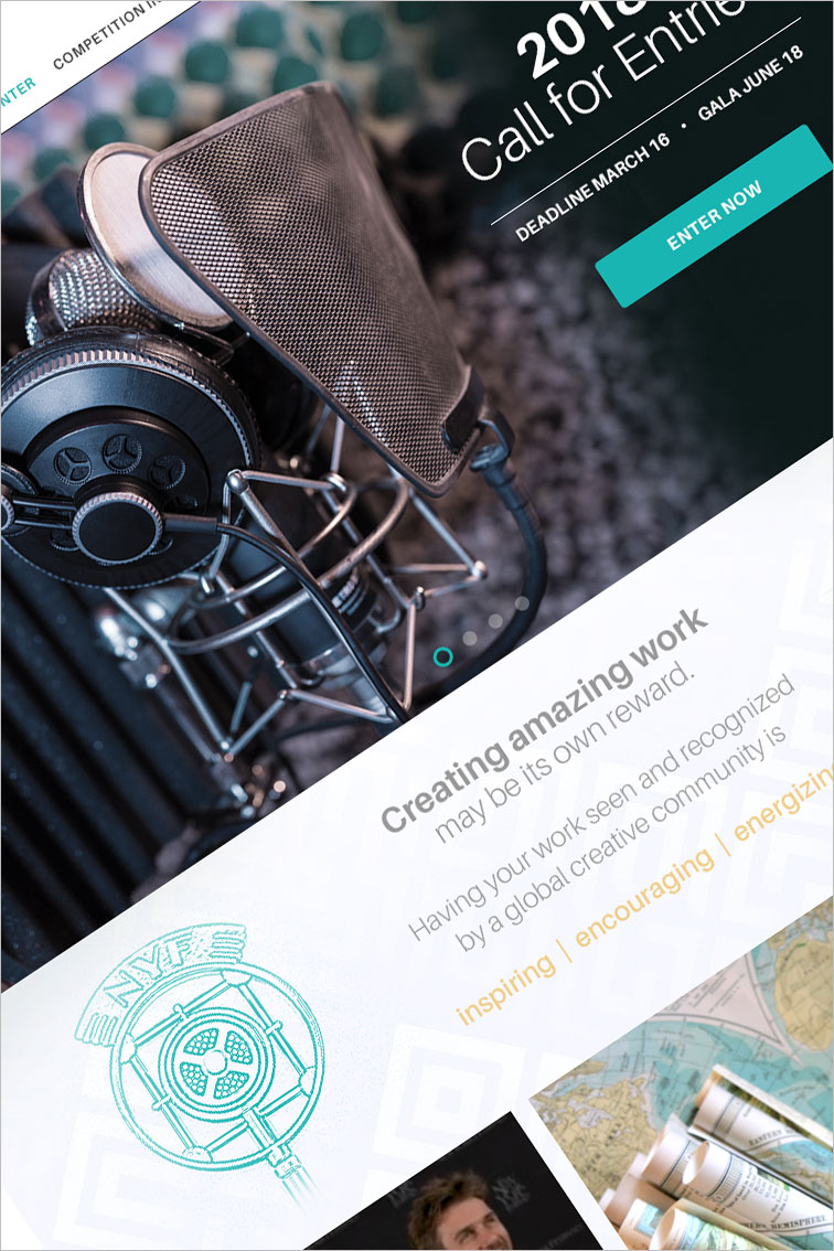
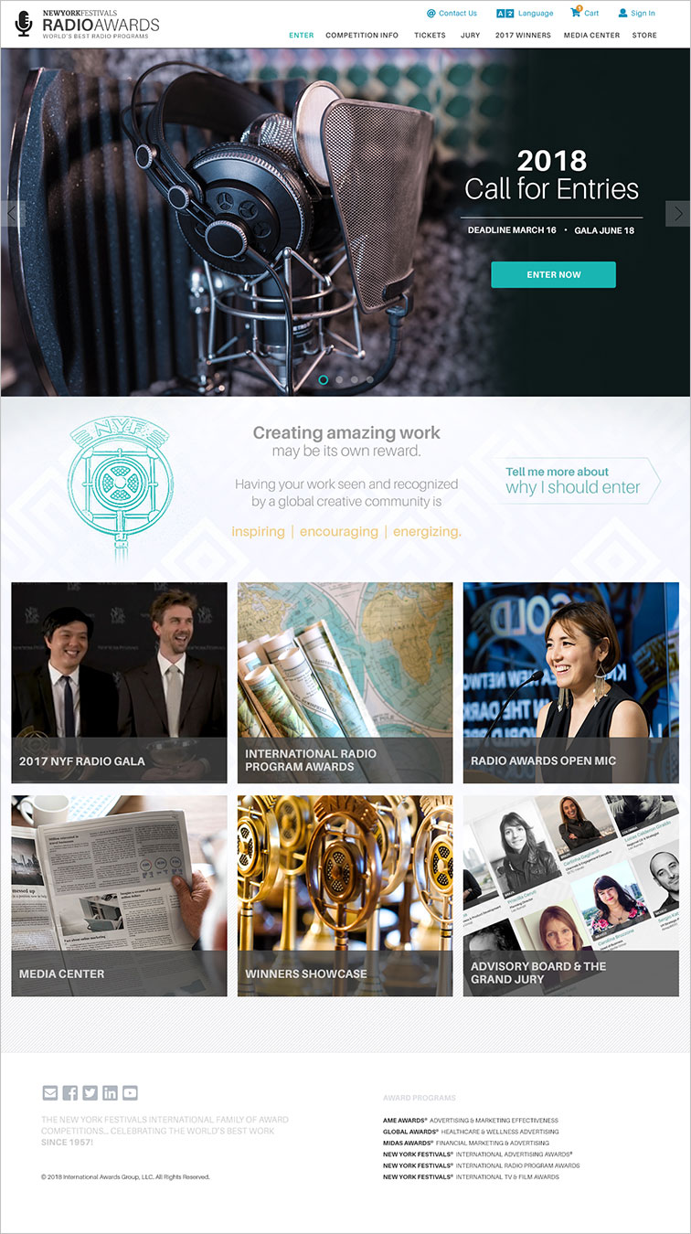
Homepage Design
The homepage design was kept simple to allow the announcment banner to catch the visitors eye. This allows the Call For Entries banner to stand out when NYF is ready to take new entries.
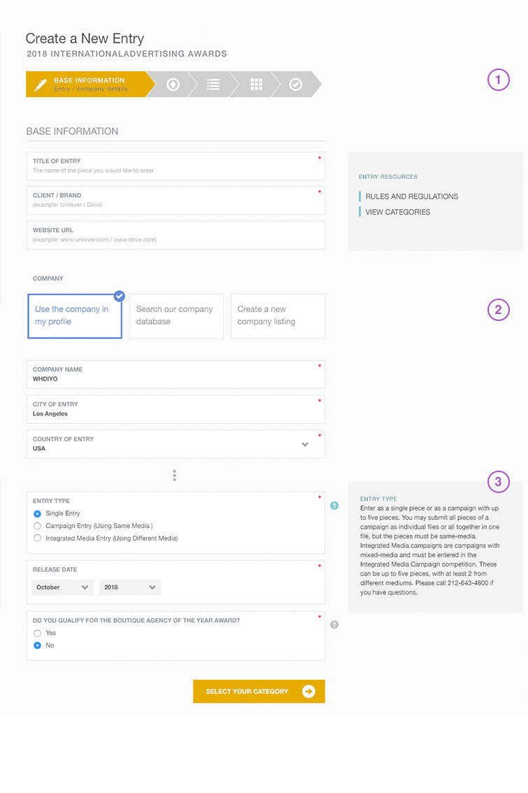
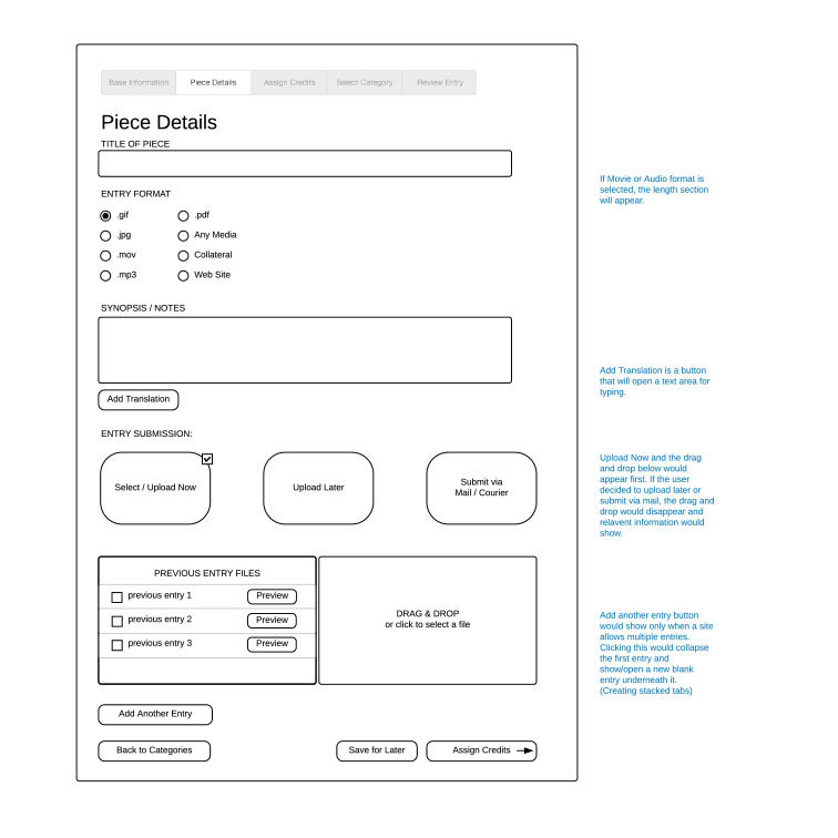
Entry Forms
There is a 5 stage form that entrants need to fill out. It's multi featured, allowing for users to save drafts, interact with elements and navigate back to different areas. (1) The arrow navigation expands as you hover over the different stages. (2) Selecting different boxes allows for different form fields to be available. (3) Help information can be added to any field in NYF's custom CMS allowing flexiblity on how they give the user instructions.
Wireframes
Wireframes were created in advance for nearly the whole site. Allowing for planning and functionality to be discussed before the design process even began. This helped immensley since these websites are complex and data-heavy.
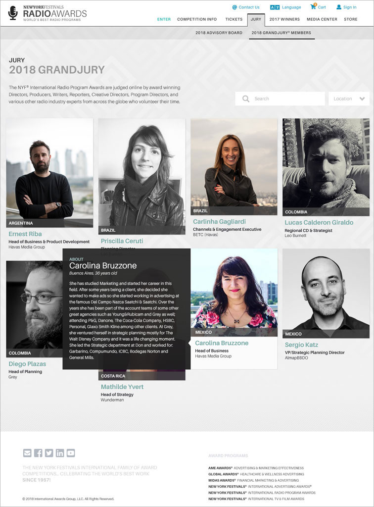
Grand Jury
MYF wanted to showcase their jury members with an interesting and flexible layout. Selecting an image allows the visitor to learn more about each jury member.
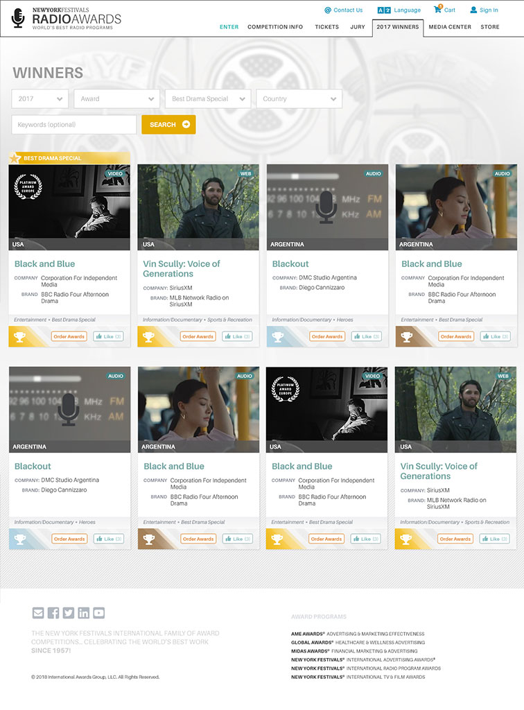
Winners Showcase
Showcasing the winners was a challenge because NYF wanted to display a lot of data but still keep the search results easy to read and more compact than their previous design. My solution allows for colors and icons to really help visitors scan for the information they are most interested in.
New York Festivals
Judges Portal
- Web Design
- Mobile-Friendly
- Frontend Dev
- Form Design
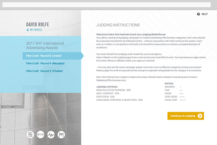
Synopsis
Along side the other projects for New York Festivals, they also needed a website for thier judges to use for voting and viewing entrant applications. The site design is made for easy of use on an ipad or MS surface specifically.
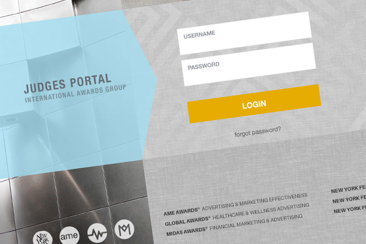
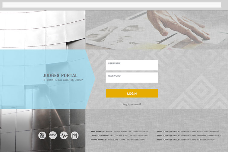
Login Page
NYF asked for a visually interesting login for the jurors portal to set the tone for them viewing creative pieces.
Entry Forms
It's a simple and easy to navigate site to help keep the jurors focused on the content and instructions. Reporting navigation only appears after they complete their assigned judging sessions.
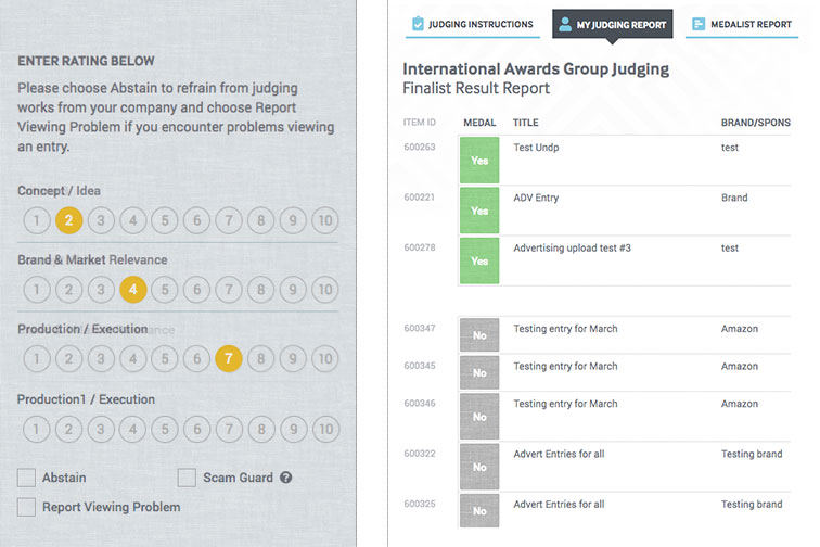
Juding Card and Reports
The judging card for each applicant has a unique design and is easy to use on a touch screen. The design for reporting tables allows each judge to see who they voted for and allows them to change thier vote if they change their mind.

New York Festivals
MasterPoint 2.0
- Web Design
- Wireframes
- Frontend Dev
- Form Design
- Interactive
- Data Heavy
- Information Design
Synopsis
MasterPoint is a custom CMS designed to handle content editing for NYF's 6 public facing sites and the Judges Portal site. On top of being an already complex CMS, it also allows the NYF staff to process and review order, manage users, competition applications, the judging process and more. Organizing this site was a huge challenge, both in the sheer amount that they wanted to accomplish but also in convincing their staff that there were some more efficient ways of combining and re-imagining how the system could work.
Wireframes
Wireframes were necessary for many of the complex systems that NYF needed. Trying to comprehend what the old sytem was doing and then re-thinking the workflow was quite a task on it's own and required many sessions of back and forth with the client to understand all the various components. The navigation was also tricky to make it easy to navigate the competitions and their unique sessions.
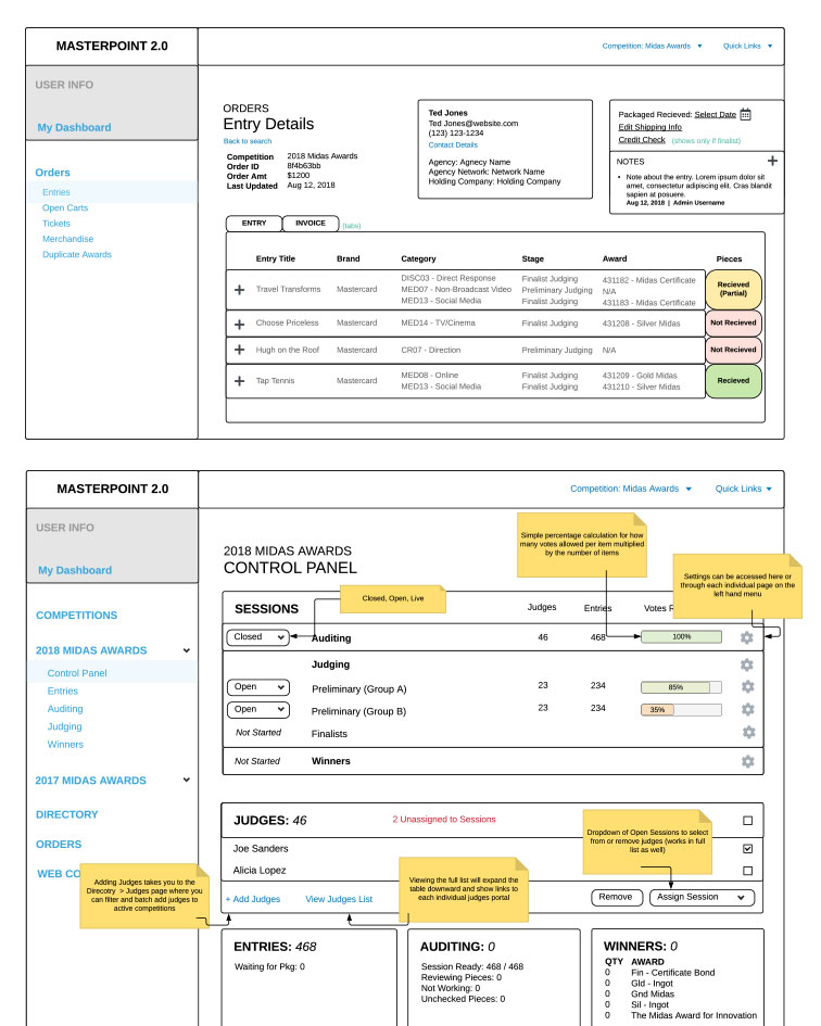
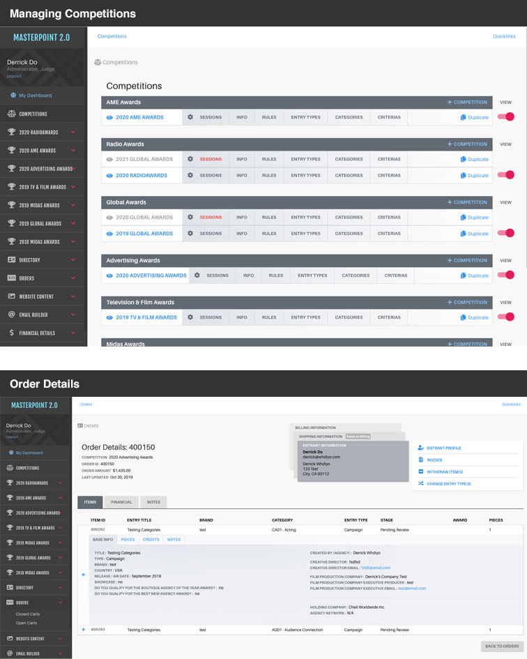
Competitions & Orders
Here you can see the new layout of MasterPoint. The navigation is consistent and setup in a way that helps staff with certain tasks to do their job easily. Orders have a lot of attached information that I've cleaned up into a series of tabs which allows for the inofmation to take up far less space and get the most important information to the staff at a glance.
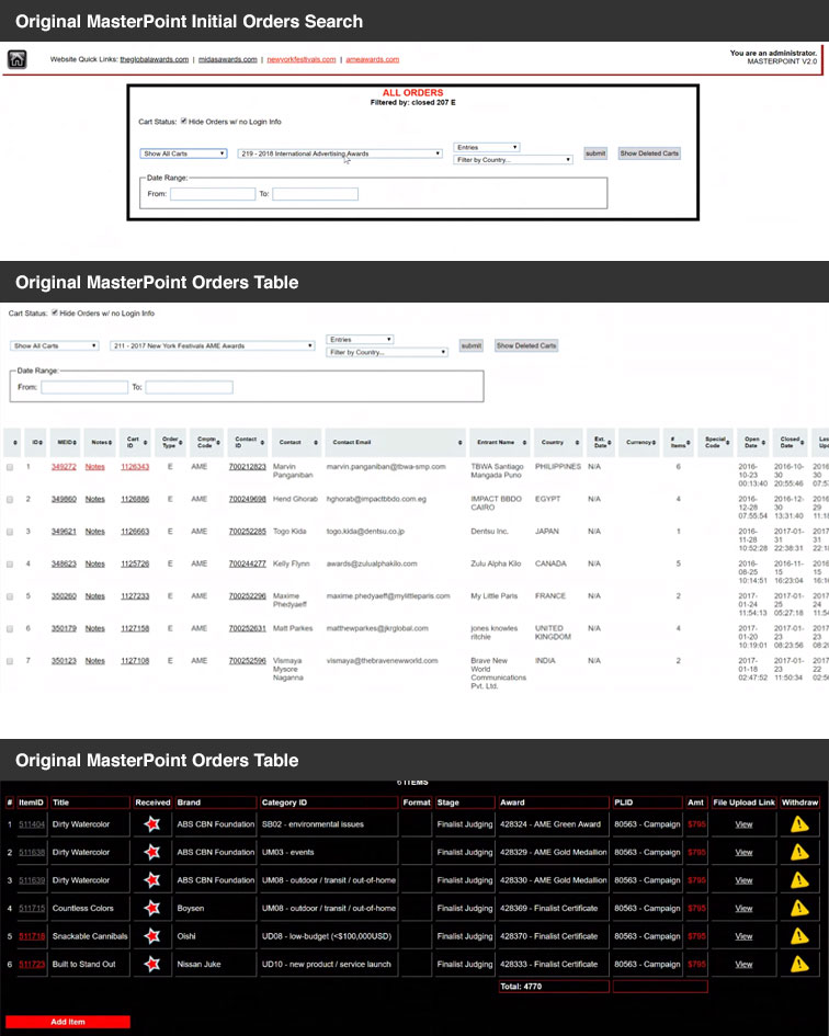
Old Orders
As a point of reference, the old MasterPoint system was inconsistent with table styles, navigation, backgrounds and more. Here you can see the order at the bottom took you to a black table with links that then linked to other information in different sections. On the previous sample, I combined all of those into one page and tabs so that staff didn't have to chace different pieces of the details down.
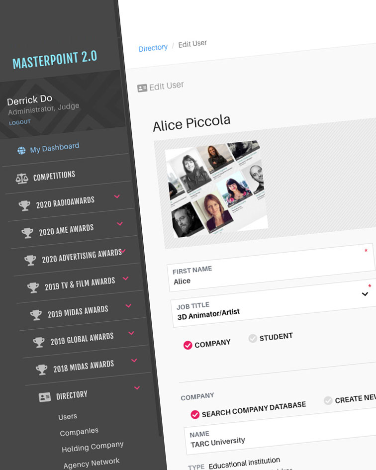
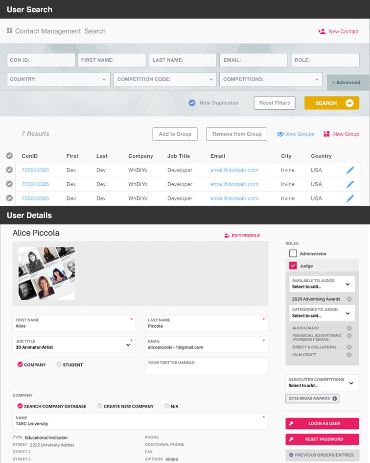
User Search & Details
The search design required a similar approach as the orders. Information in the old syste was spread out and hard to manage. I've made the search more condensed with an advanced section as needed. I've also made the User Details into a more management style page that allows staff to quickly assign user multiple roles or to multiple groups as needed.
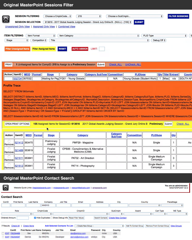
Old Sessions & Users
At the bottom, there's an example of the old user search. In contrast to the new design on the previous sample. The table required sideways scrolling and the fields were so numerous it was hard to find what you needed. The top section was the old session manager. You'll see in the next sample how I drastically alter the workflow and layout for dealing with competition sessions.
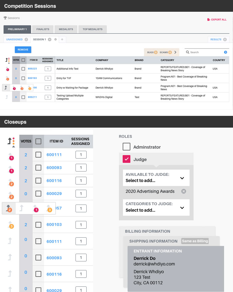
Competition Session and Closeups
Here you can see the new wrokflow for the competition session management. I've split this into a series of tabs that allows NYF's staff to manage everything together. They can view each stage of the competition and manage or create sessions under each and assign jury members to each section. They can also view the results and close or open sessions for the settings menu on the tabs. Depending on the type of competition, there is a priority sort order on the left of the table that allows them to mark items that need close attention. The bottom left shows a close look at this interactive element. I've also included a close up of the Roles and Order Addresses as all of these components are interactive and animated.


Pocket Mystic
- Branding
- Social Media
- Merchandise Design
Synopsis
Pocket Mystic is a group that I design tshirts for occassionaly. It's a creative outlet for me and allows me to explore a new artistic print medium.
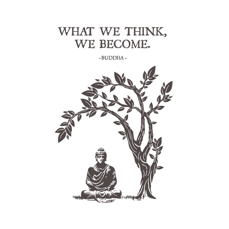
Buddha Design
This design in particular I had a lot of fun creating. I hand drew the tree and then altered it graphically to match the style of the sitting Buddha. I took the image of Buddha from an image of a statue and then altered it in layers to achieve the final result.
Branding
I had some fun designing the logo. Since the theme is around spirituality, the logo uses a sun, moon and star which represent many ideas within spiritual practices. They encapsulate one another, representing the mind, body and spirit being united.
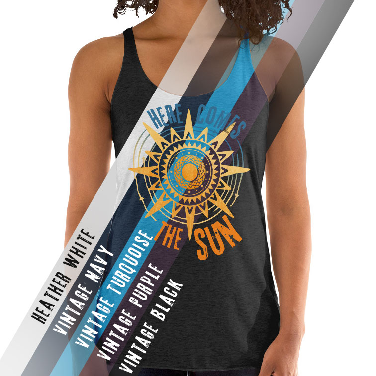
Marketing
Creative marketing images allow visitors to get an idea of what's available and get an idea in one glass regarding color combinations with the design.
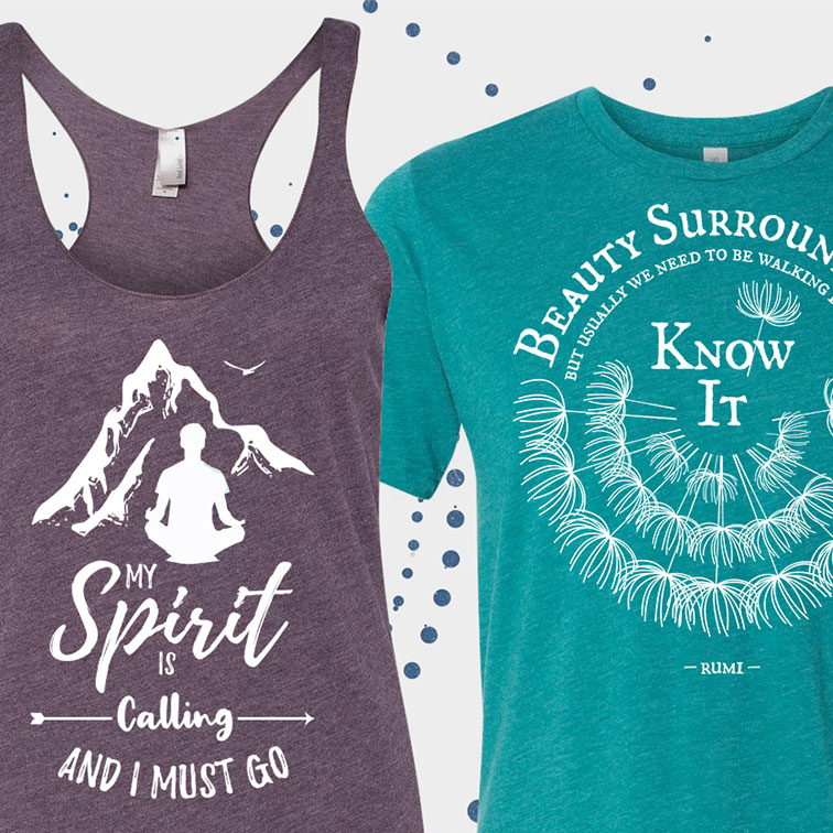
Many Unique Designs
There's meaning in so many symbols and cultures. Here are some examples where I'm just playing around with some of those concepts. The OM symbol was painted by hand to achieve the brush effect.
Social Media
I created banners and images specifically for marketing on different social media platforms. This image is part of a series that used some of the most popular designs.

MANATT
- Frontend Dev
- Responsive Design
- Kentico CMS
- Information Design
- Written Proposal
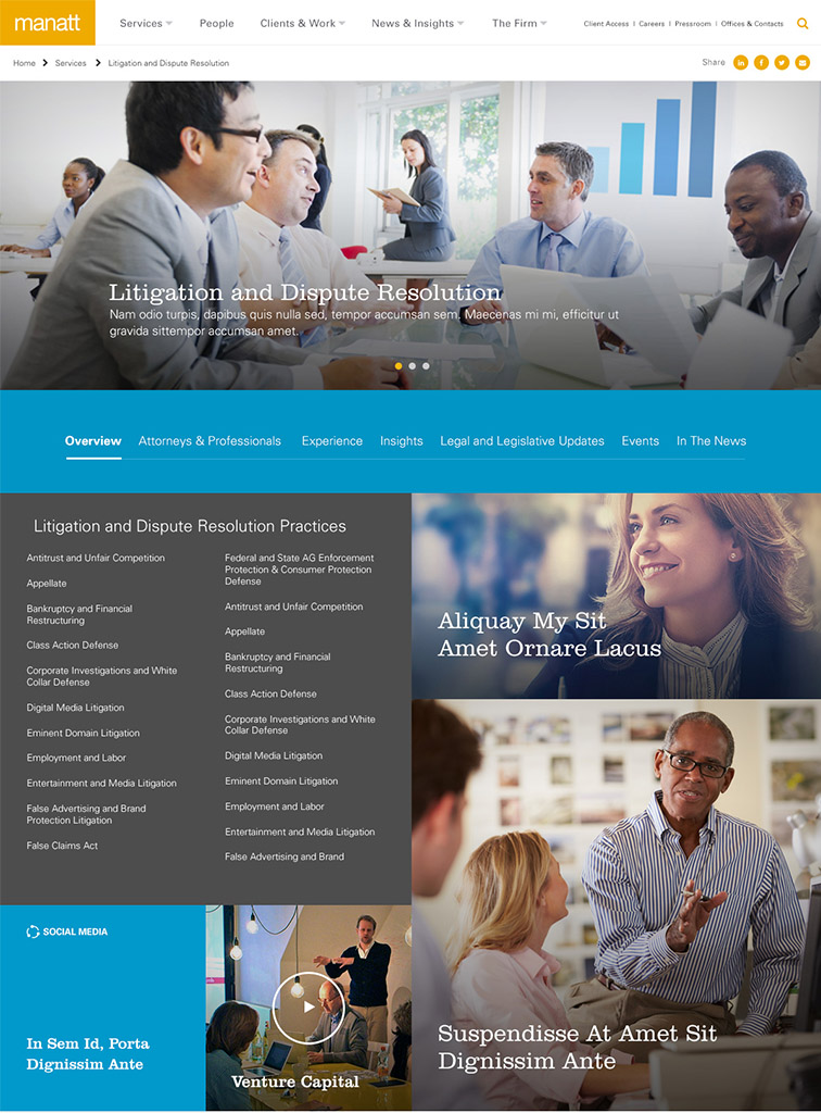
Synopsis
This project was primarily a development project for me. Manatt had already contracted a design and needed it to be developed and completely Responsive Design. They also were having trouble coming up with a navigation system that worked for their site. I put together some samples for their navigation and found a solution that worked for them. The development of the site was difficult because the design was complex and image heavy and at the time, some browser features like CSS Grid were not widely supported.
The Website
The website was developed in the Kentico CMS. It added some limitations to how the code could be manipulated and added an extra challenge to dealing with responsive image sizes. I put together a image sizing quide for Manatt's content team and worked with their team to determine how the designed content translated into their actual content.
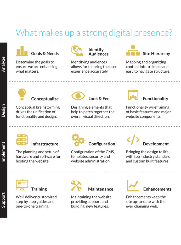
Proposal
I wrote and designed the proposal PDF to Manatt. Here is an example of one of the pieces within it, outlining the process the Thinklogic team used at the time.
Navigation
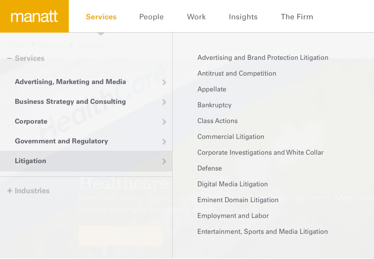
Manatt was very concerned about their navigation. They didn't have an easy to use navigation or any idea for how to make so much content easy to navigate. In the end, I divided their navigation into a two piece mega-menu that allowed their different audiences to view Services and Industries, with categories and links under each category.

Chatsworth Products
- Web Design
- Frontend Dev
- Responsive Design
- ConnectedApps CMS
- Site Architecture
- Information Design
Synopsis
Chatsworth (CPI) is a large international industrial automation company. They were having trouble with their navigation and in need of a way to sell their products through an online interface. They insisted that iit be a seperate section of their site and to keep their original site as it was. I did maintencence and content updates on their main site and also designed and did the front-end development of their catalog site.
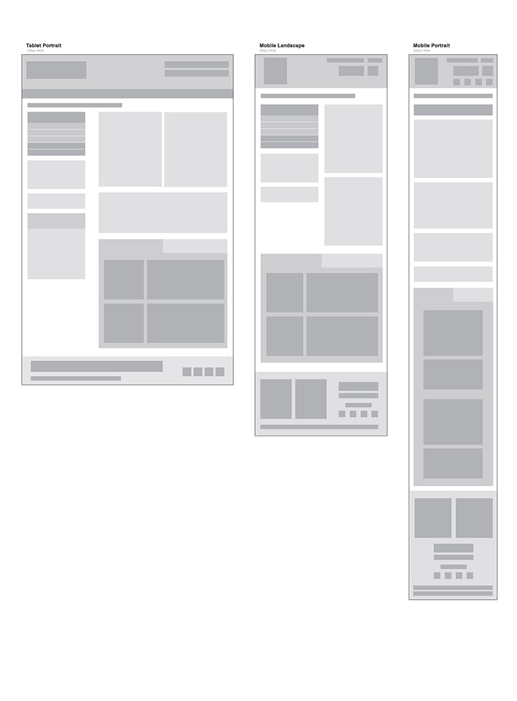
Wireframes
A simple set of wire-frames were created to help the CPI team understand how the content collapses and expands on different pages.
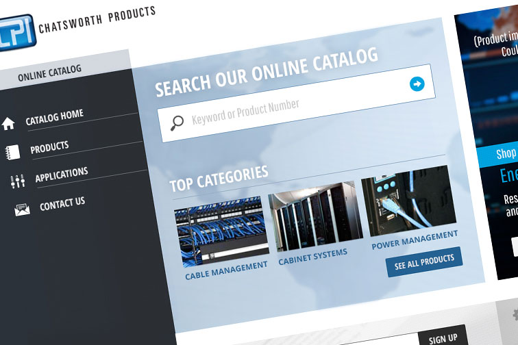
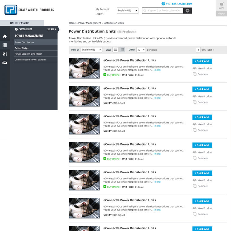
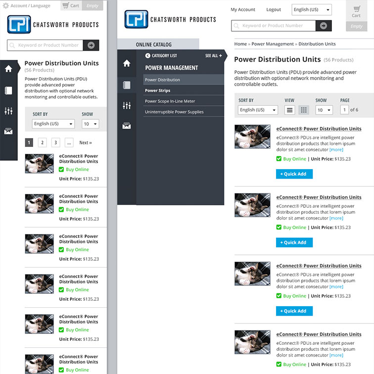
The Catalog
This mockup shows the layout for the products themselves and includes the UI features to help visitors compare products and quickly tell what products can be purchased online. The navigation is in it's second Please note that this mockup was done before product images were provided, leading to kittens being used in their stead.
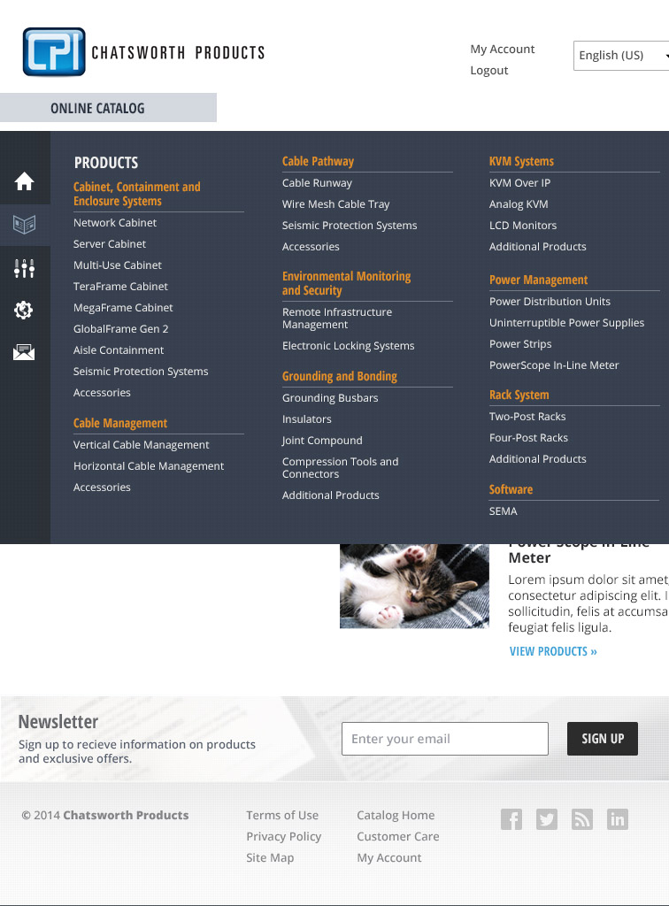
Mega Menu
With such a large catalog, it is difficult to organize the navigation in a way that works well for Bothe desktop and mobile. I designed the menu to have an initial stage that works on all devices. On larger devices you can expand the menu to show each sub-category across the screen. On smaller devices this list is re-oriented to be vertical and scrollable.
Mobile
The mobile and tablet mockups show examples for how the content and menus collapse at different sizes.


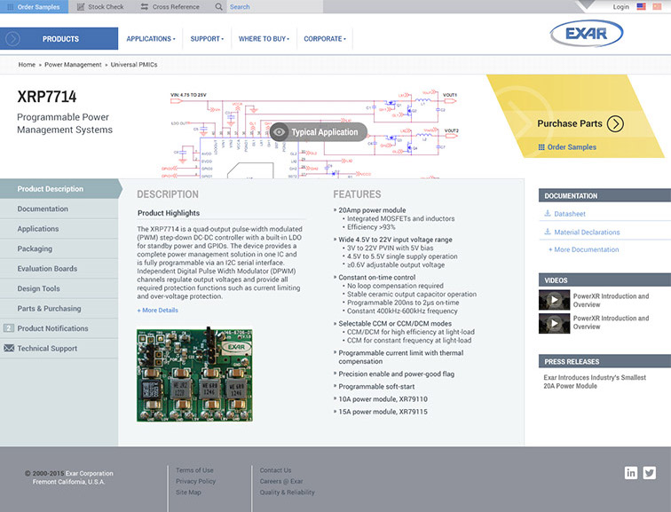
Exar
- Web Design
- Frontend Dev
- Responsive Design
- CMS
- Information Design
- Data Heavy
Synopsis
EXAR needed a complete redesign of their website. They needed to go from an old mid-2000s site to something much more modern and professional. With an extensive amount of products and documentation, they required solutions for site hierarchy and navigation, information architecture and a new login area for returning customers.
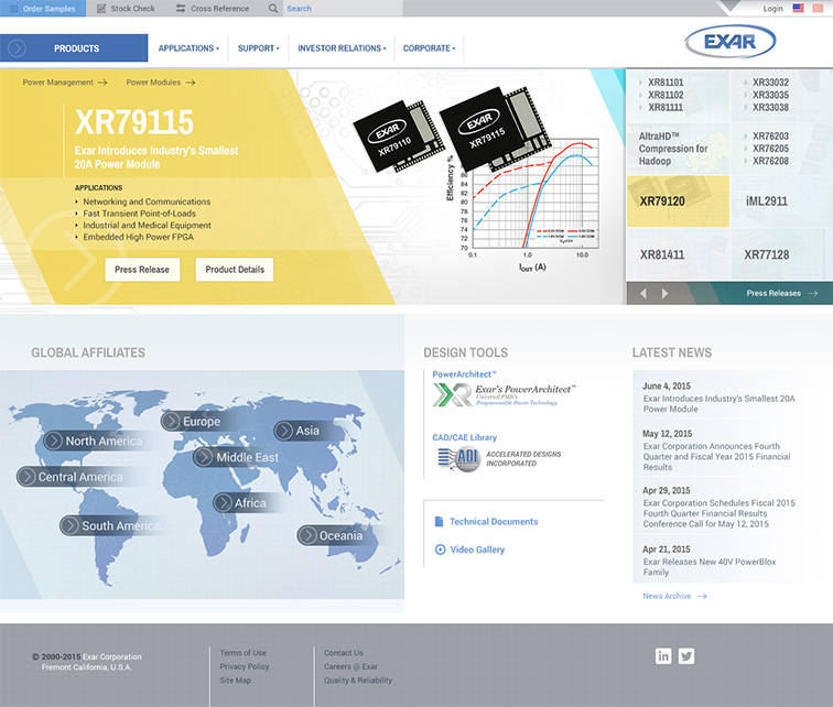
Homepage
I used bold colors and a unique animation to highlight the product slider on the home page. The custom built slider also had a unique navigation on the left to make it easier for the part numbers to be seen.
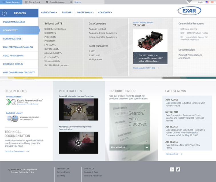
Mega Menu & Branding
A large custom mega menu was designed to allow for sub categories to be explored and product highlights to be implemented. The branding is uniquely on the right side of the header to bring more attention to the products. Since the EXAR customer base was well established, they felt confident that they could get away with a different placement. By doing this, the header height was able to take less space and it brought the page content up to be that much more visible. This also allowed the responsive navigation to be more consistent between different screen sizes.
Design
I’m only displaying a small number of mockups in the portfolio, however every page was designed before it was developed. There are over 50 unique page designs to keep the site interesting and consistent throughout.
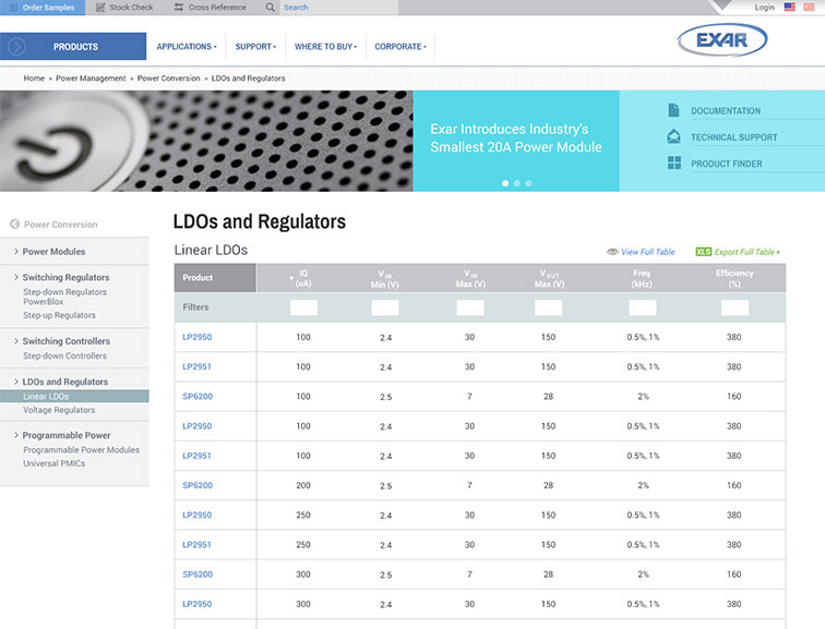
Product Pages
These pages are unique in that they have the schematic of the product showing at the top to view the typical application. A product menu on the left allows users to view all the information related to the product and get notifications on changes.
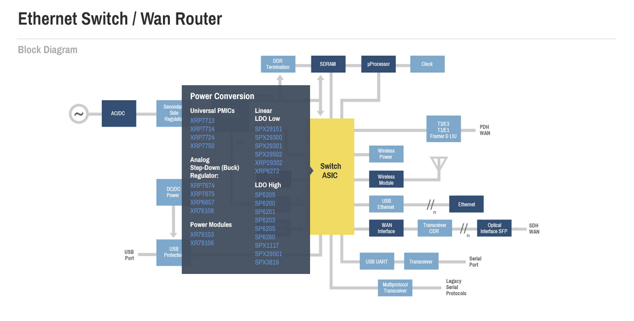
Interactive Documentation
A very unique component that EXAR wanted to implement was interactive documentation. I took some of their block diagrams and redesigned the look and feel of them. I then developed them to have hover effects that allowed visitors to learn about each component and click through to related parts.

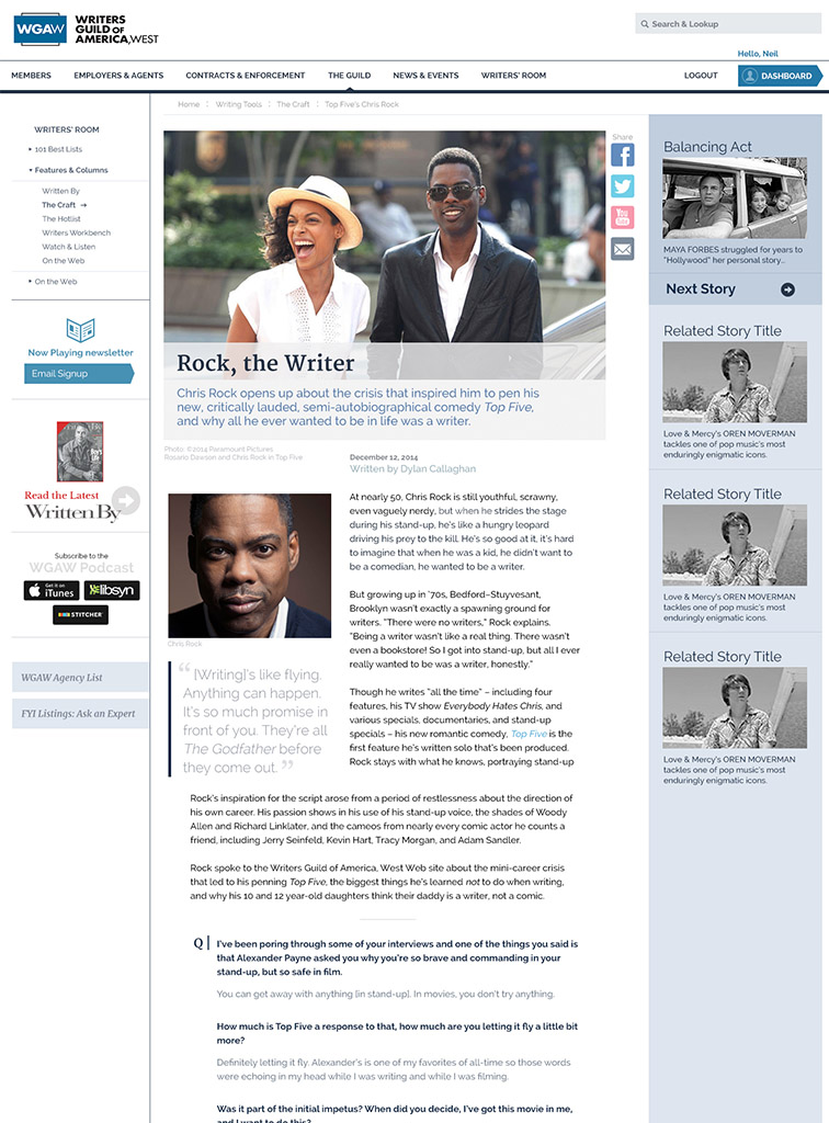
Writers Guild of America, West (WGAW)
- Web Design
- Frontend Dev
- Responsive Design
- CMS
- Information Design
- Data Heavy
Synopsis
WGAW is the Writers Guild for the west side of the United States. They support and represent the interests of a large group of talented people who primarily write and produce scripts for filmography. In order to serve their members better, they needed a new site that made their features and information more accessible.
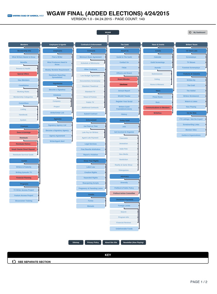
Site Map
Organizing the site was a challenge within itself. a full site audit was required to understand the complexity of information that they had compiled over the years. We went through many iterations trying to create a sitemap that would make sense to the WGAW members.
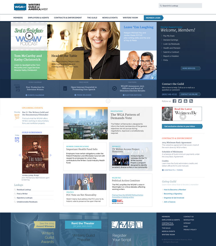
Design
The design need to be primarily typography driven and feel more like a newspaper or magazine than a standard website. The homepage required a custom slider that allowed them to put multiple images/topics on each slide. The design process required many unique layouts to be mocked up to make sure there was variety in the design while still maintaining an overall look and feel.
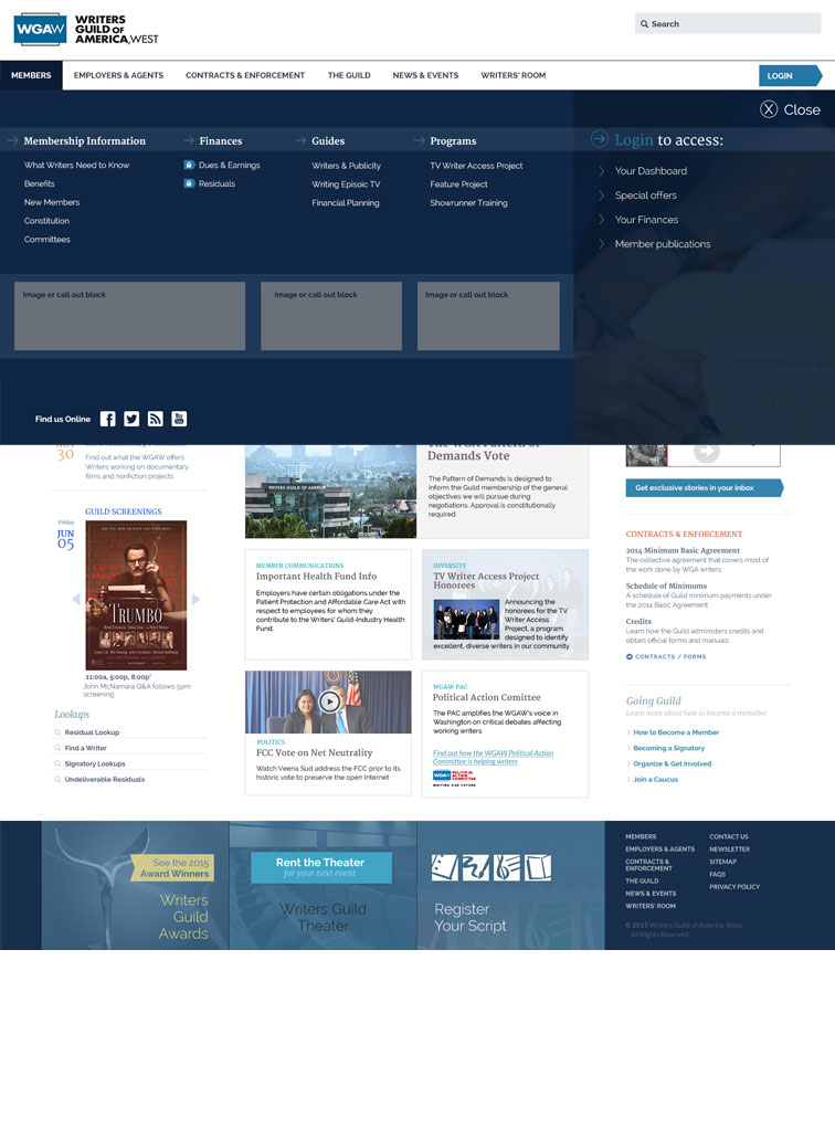
Mega Menu Tour
The navigation is a unique full screen interaction. It has two main panels, one for the site navigation and one for logged in members to get a small dashboard and list of pages they visit often.
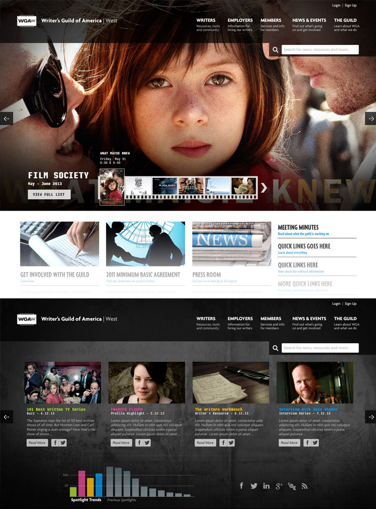
Initial Mockup
They had a few different groups bid on this project and part of that was to do an initial pie-in-the-sky homepage design. I’ve shown two different homepage slider mockups here. They only gave vague direction without any information about what they were ultimately wanting their site to be like. You can see the design came out much different, but it was fun to do this initial design none-the-less.

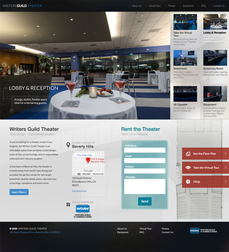
WGA Theater
- Web Design
- Frontend Dev
- Responsive Design
- Interactive Design
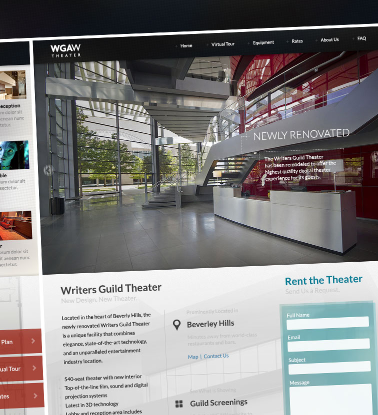
Synopsis
WGAW Needed a redesign on their theater’s website. The main goal of this site was to allow the theater to be booked for events. This meant that they needed to have a prominent form for visitors to easily request a booking. They also wanted the new site to have a modern feel to go along with the theater renovations that they were in the process of finishing.
Design
The site is simple yet clean. It uses very subtle layers of images and sheens of color to represent filmography while not being too distracting.
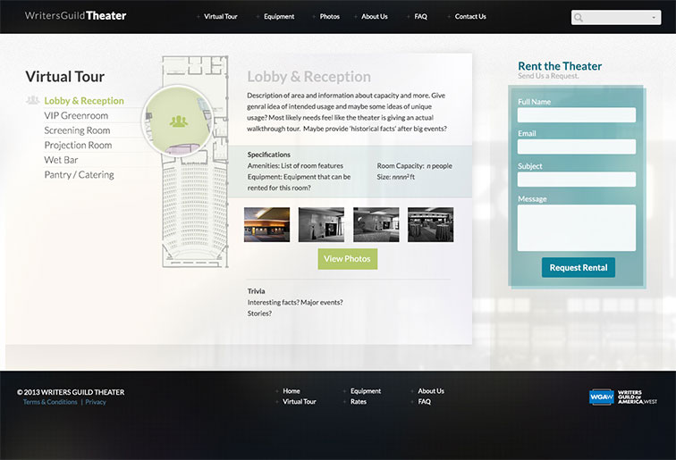
Interactive Tour
I designed and developed this interactive tour that allows visitors to see the layout and learn more about the different spaces within the theater. It collapses for and works for mobile as well.
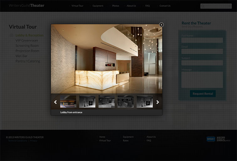
Light Box
Each section of the tour as a gallery to go with it. I customized the lightbox to have the same subtle play around light and dark found in other parts of the site.


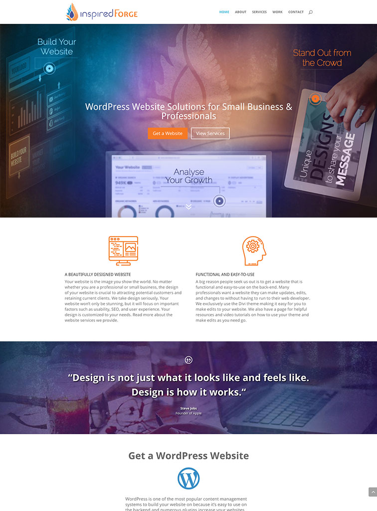
Inspired Forge
- Web Design
- Branding
- Frontend Dev
- Responsive Design
- Wordpress
Synopsis
Inspired Forge is a small web design and development team that needed a new design and brand for their business.
The branding combines a few concepts into one to convey the creativity of the team. The flame which is required for that spark of insirtation and heating up for the process of forging. The bird, which sybolizes the idea taking flight and rising above. And the water droplet, which represents the cooling and refining of the cretive ideas.
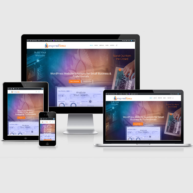
The Website
Overall a simple yet intersting design to quickly convey what inspired forge does and who would most benefit from their servies.
Responsive Design
The site is completely Responsive Design and easy to navigate on all devices.

Written By Magazine
- UI/UX
- Web Design
- Frontend Dev
- Responsive Design
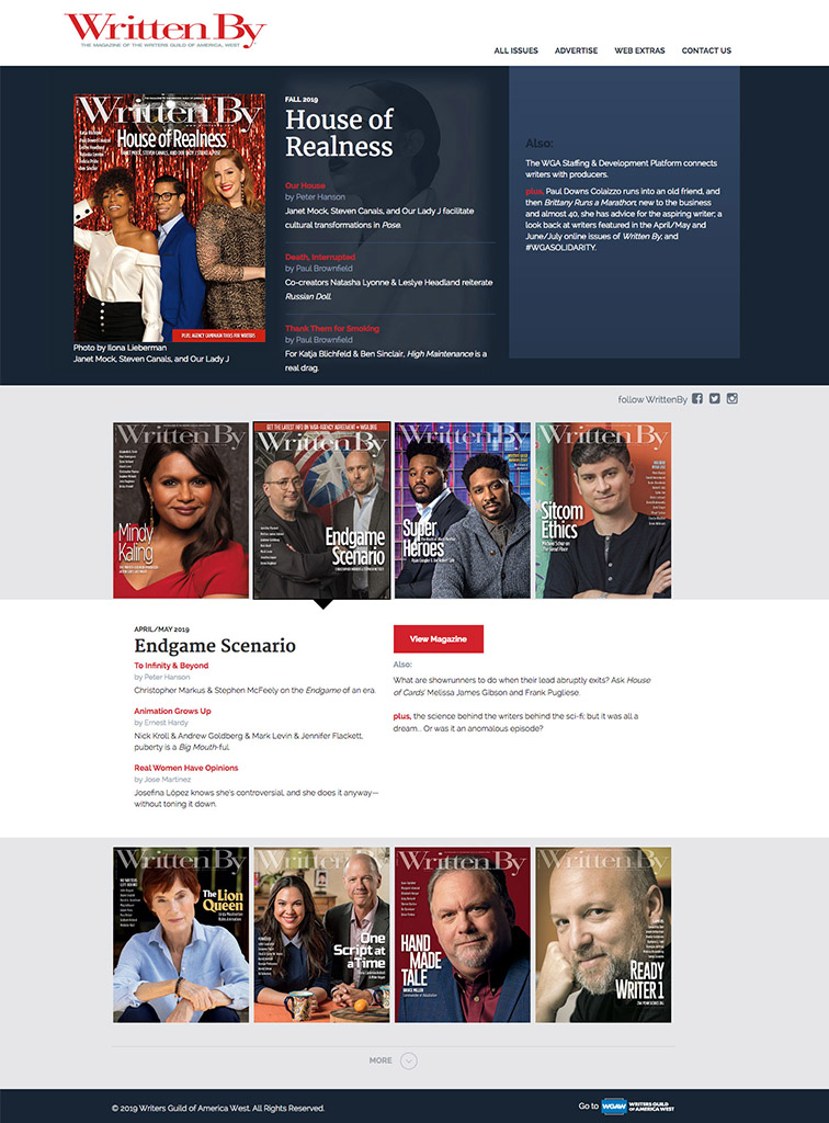
Synopsis
A fun little site to show previous versions of the WrittenBy Magazine which is produced by WGA West. The design is simple and clean but still interesting enough to represent the feel of the magazine. It uses similar colors to the WGA West website to link them together however still has it’s own separate feel, which is what the client was looking for.
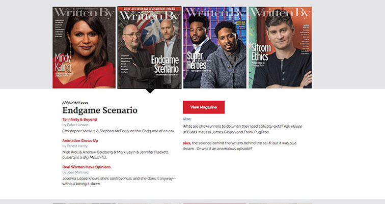
Interactive
A small interaction design component was used to make browsing the recent editions a little more interesting and compact.

Teletrac
- UI/UX
- Frontend Dev
- Responsive Design
Synopsis
Teletrac was in need of an extensive site redesign. They required a mobile-friendly site and many custom features for customers. I helped them by designing a maticulate set of wireframes, interactive mockups and eventually front-end development work.
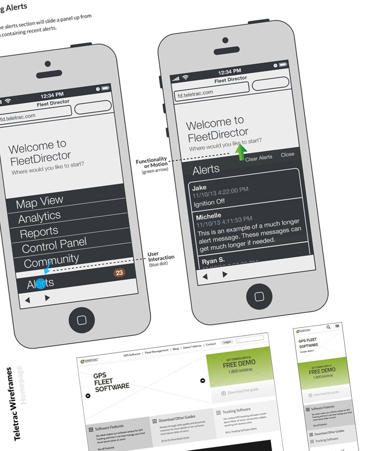
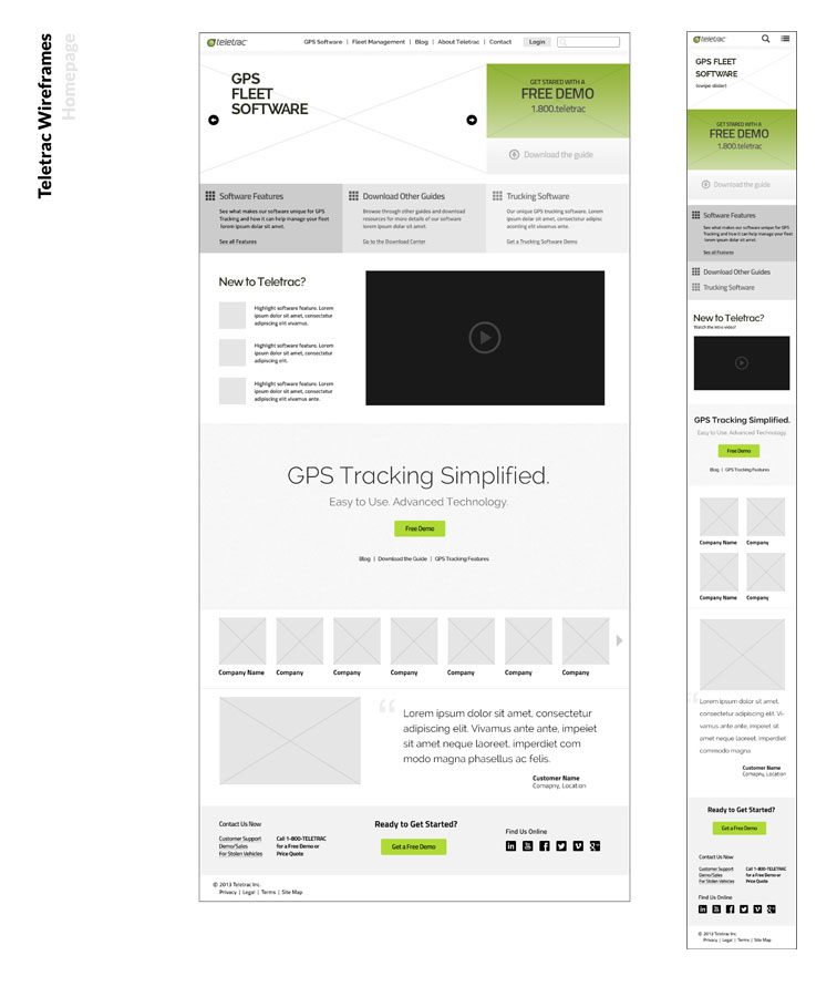
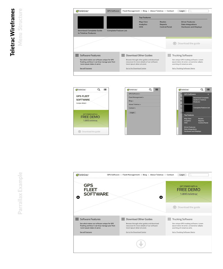
Website Wireframes
I made these more stylistic wireframes to show them both layout and a simple design language to build from. They loved the style and ended up using it as the foundation for their in-house design team.
Website Wireframes
I made multiple layouts that allowed them to have different content based on the type of page they were on. This wireframe primarily shows how the menu layout would look on movile and desktop.
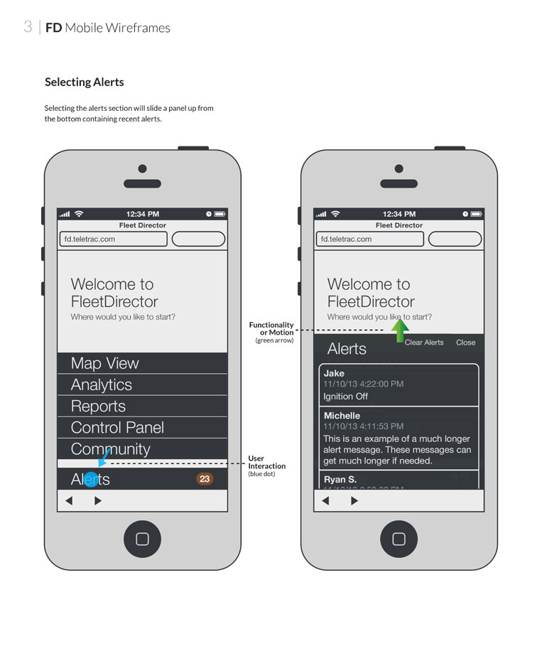
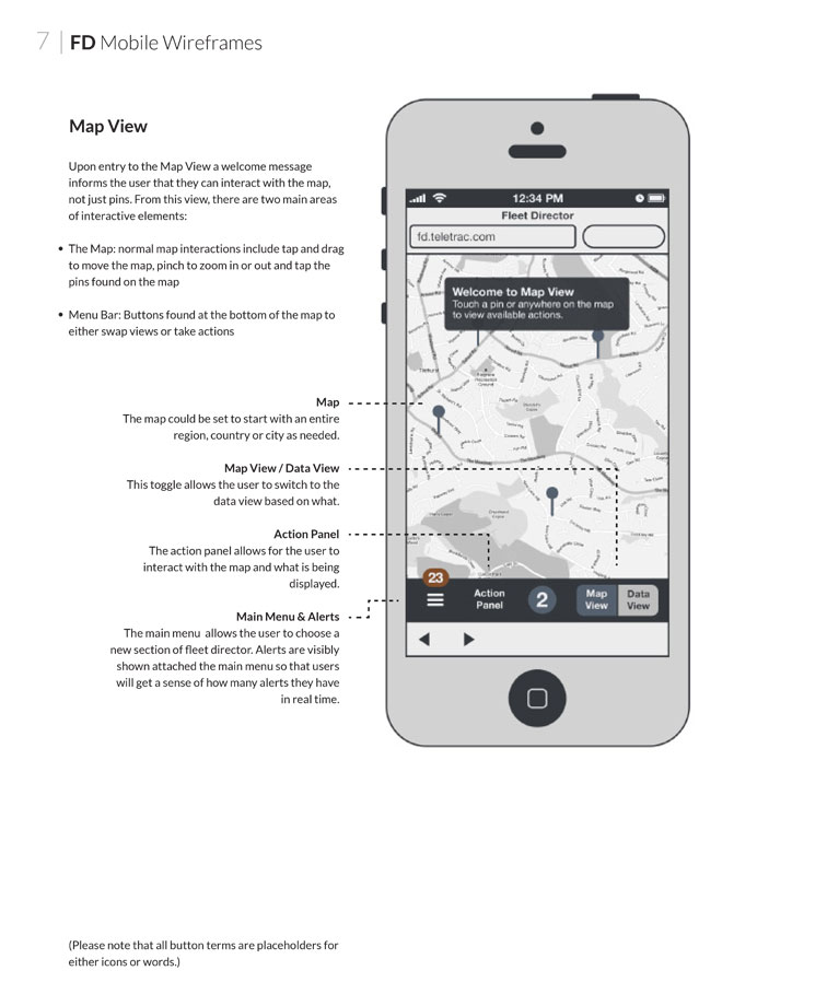
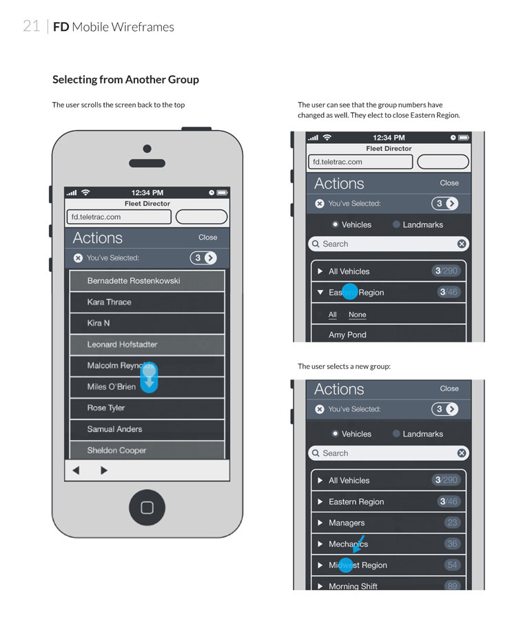
Fleet Director
One of Teletrac's main projects was a mobile app for their clients. We went through extensive wireframing to show ever interaction and feature in detail.
Map View
This interface allows truck drivers to interact with locations, mark actions for each location and view their driving data.
Wireframes
The Fleet Director wireframe project only included mobile, as this is how the truck driver's would access the service. Eventually the design was expanded to fit tablets as well, however we did this furing the development phase and I am not able to show samples of that work.

Sabbatical Homes
- Web Design
- Frontend Dev
- Responsive Design
- CMS
- Information Design
- Data Heavy
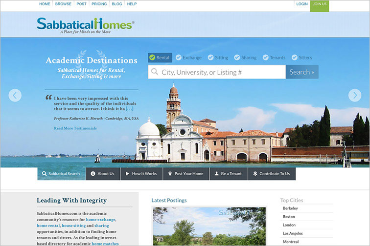
Synopsis
Sabbatical Homes was in need of a large redesign. Their site used nearly no images and was very basic. Working closely with the CEO I designed a beautiful website to represent their International services.

Story of Movies
- Web Design
- Frontend Dev
- Responsive Design
- CMS
- Information Design
- Data Heavy
Synopsis
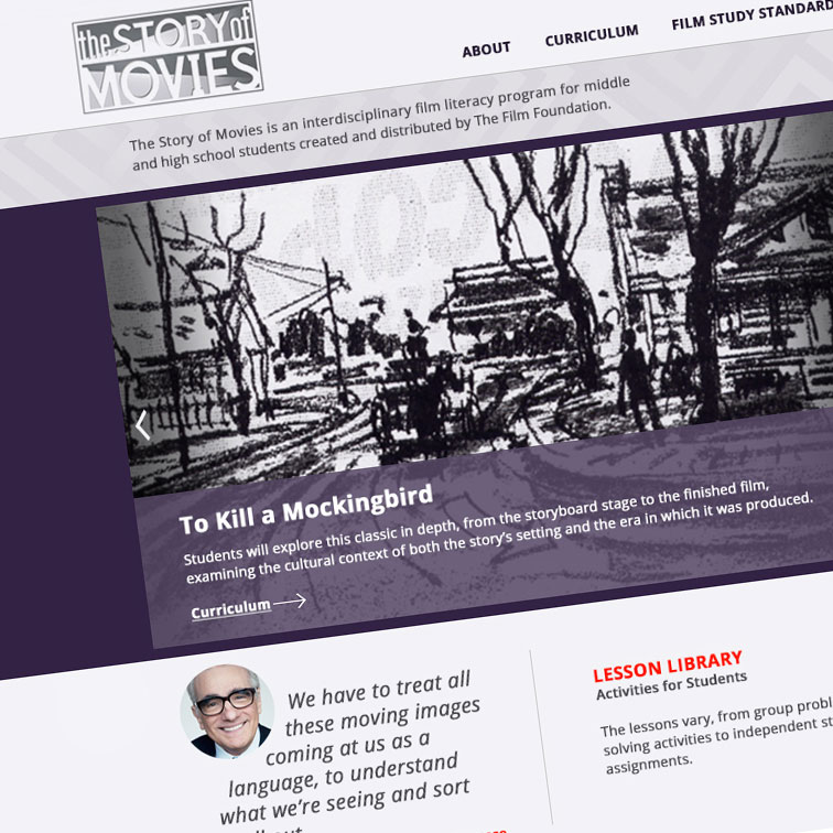
The Story of Movies is a branch website done by The Film Foundation. I participated as a design consultant and front end developer on their main website. Later when they wanted someone to created a small website that tied into the original site, they came to me to do the design and development.

LA Technical Trade College
- Web Design
- Frontend Dev
- Responsive Design
- CMS
- Information Design
- Data Heavy
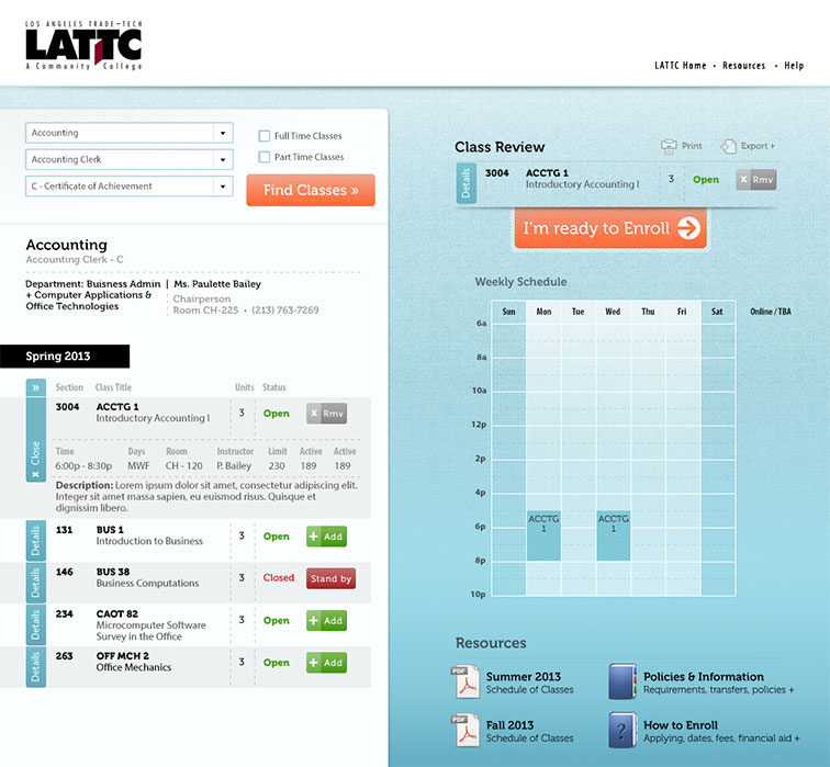
Synopsis
I designed and developed this fun and interactive college class scheduler for LATTC. To make it easier for new students to signup for class, they wanted their catalog and scheduler to be combined into an easy to use tool that appealed to young college students.

Eyes on Sports
- Web Design
- Frontend Dev
- Responsive Design
- CMS
- Information Design
- Data Heavy
Synopsis
Eyes on Sports was in the process of appealing to potential sponsors and desired a website to tell their story. I did a few iterations of designs for them, but I thought I’d showcase the most unique graphics here. Since I don’t get to do as much vector or icon graphics in my normal work, but I do enjoy creating these.
ABOUT ALICE
PROFESSIONALLY I am a web designer and front-end developer. I've worked in a variety of enterprise level and open source platforms, CMSs and other frameworks over my professional web career which began in 2007. I specialize in UI/UX design that is functional and beautiful across all devices. I'm experienced in designing a project from start to finish; taking a project through many stages including concept, hierarchy, wire-framing, prototyping and then front-end development with interaction design. I also have experience with branding, vector graphics, print design and other artistic crafts. I am currently exploring more with SVG animations and other new animation technology available to browsers.
PERSONALLY Beyond my work, I have a lively and quirky personality which aids in my love of laughter and smiling. I enjoy yoga, hiking, gardening, herbal medicine, cooking and anything else that connects me with nature. I've studied and taught yoga through an international organization and have certificates in Hatha yoga, restorative yoga, gentle yoga and Ayurvedic cooking. I enjoy traveling and have visited many countries around the world. Artistically, I have dabbled in acrylics, silk painting, beading, candle making and Celtic knots and ropes. I also like to relax with friends online and play board games, team games and have recently started playing Minecraft, primarily for the design and logic components of the game.

CODING APPROACH I primarily use CSS 3, HTML 5 and jQuery to build the front-end design and interactions. I prefer to structure my code with future features in-mind even if it means taking more time upfront to save time later. Primarily, the project I've worked on are either PHP or ASP.Net, but I have experience working with other back-end languages and frameworks. As I am often both the designer and developer of a project, it gives me insight into how something can be built while I'm designing it. This does not limit my designs however! I often end up challenging myself by coming up with concepts that aren’t straight-forward for development.
EDUCATION I took an early interest in creating computer graphics. At the age of 11, I could sit for hours and hours to create pixel artwork in MS Paint. I loved to calculate the colors to create gradients of colors. At age 12, I discovered CSS and HTML and proceeded to learn it by deconstructing the code of sites that I thought were interesting. I started to make my own websites for friends and had ran several sites by the time I was in high school. I took courses in programming in both high school and college. My strong interest in art lead me to study and earn my BFA in Visual Communication Design at the University of Washington. It was then a natural progression for me to become a web designer as this combined my degree with my interest in web development.